
Dark Divi 5 Layouts
Dark layouts trade the default white glare for deep, controlled backgrounds. The kind of canvas that makes accent colors punch and product photography feel cinematic. Done well, a dark Divi 5 page reads as premium and considered; done badly, it reads as unreadable. This category collects the ones we'd actually ship.
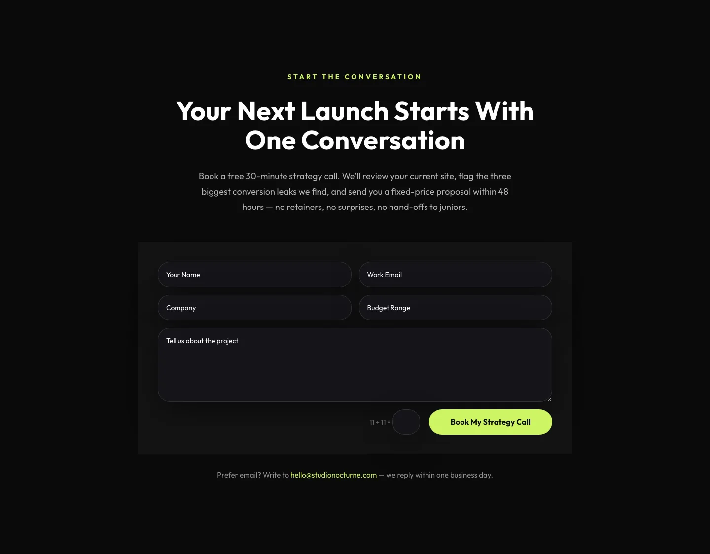
Dark Agency Contact Form: Book a Strategy Call Divi 5 Layout
contact · agency · dark

Dark Agency CTA Section with Strategy Call Booking & Proof Stats: Divi 5 Layout
cta · agency · dark
What makes a dark layout work
A dark layout is not a light layout with the background inverted. Contrast has to be re-tuned end to end: body copy sits around #D9D9D9 rather than pure white, headings breathe with a touch more weight, and dividers drop to subtle 8–12% opacity so the composition doesn't fracture into hard lines. Depth comes from layered near-blacks (a #0B0B0F canvas, a #14141A card, a #1C1C24 hover state), not from drop shadows, which mostly disappear on a dark ground.
The accent color does more work here than anywhere else. One saturated hue (electric violet, chartreuse, molten orange) carries every CTA, link, and focus ring; a second neutral warms up portraits and product shots. Imagery should be shot or masked for dark backgrounds: transparent PNGs, edge-lit photography, and generous negative space beat stock photos with white halos every time.
Who reaches for dark
SaaS and developer tools use dark to signal technical seriousness: think dashboards, terminals, and code samples that finally look at home on the marketing page. Agencies and studios use it as a portfolio frame, letting client work carry the color. Fashion, spirits, automotive, and audio brands lean on dark for the premium cue. Anywhere the product itself is bright (screens, jewelry, lighting, cars), a dark layout gets out of the way and lets it glow.
Customizing one in Divi 5
Each layout in this category ships as a validated Divi 5 JSON export with real, functional modules: no placeholder nav, no dummy grids. Import it into Divi 5, then work from the top down:
- Presets: every heading, button, and card is bound to a preset. Retune the H1 preset once and the whole page follows. Don't restyle modules individually; you'll drift.
- Palette, swap the accent in the global color palette rather than per-module. The neutrals (canvas, card, border, muted text) are named so you can rebalance contrast without hunting.
- Copy, the sample copy is written to real word counts. Keep headlines short and specific; dark layouts amplify vague marketing language because the eye has nowhere else to go.
- Imagery, replace stock photography with transparent-background renders or edge-lit shots. If you must use a rectangular image, add a subtle radial gradient overlay in the module background to blend the edges.
Every layout here passes our deterministic Divi 5 structure validator before publication, ships under a one-site commercial license, and previews with real desktop and mobile screenshots so you know what you're downloading.